
I was experimenting with the modern text input control and its relation to notifications if a user is about to or has hit the character threshold for a column. I ended up using a few of the built in functions of the new control along with a second text control to notify the user as to where they are at in their character length. The first part of the post covers how to do all the coding manually. The later part explains how to do it more efficiently using variables and components.
Table and Colum setup
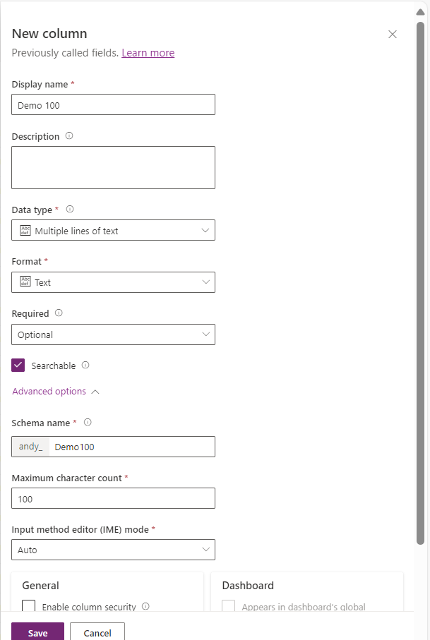
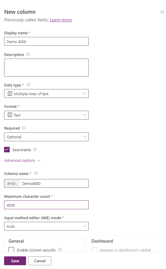
For this example, I have created a Dataverse table called Demo Table and two text columns; each called Demo 100 and Demo 4000
Canvas App
I have created a canvas app called Demo Canvas App and enabled Modern Controls, then added the new Dataverse table to the app.
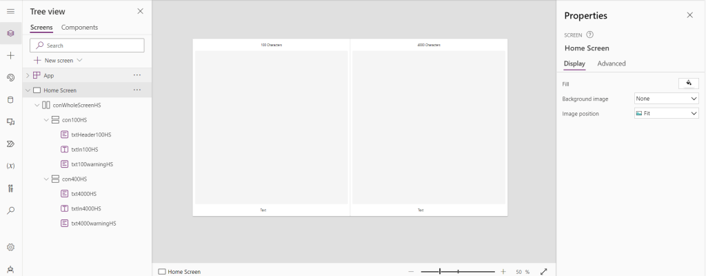
In the app, I have added three containers to store the various controls. Each one will store a header, a text input, and a warning text.
Each of the text inputs are set to multiline with flexible height. They will also have the Trigger output set to key press. Set the max length of each of the controls to their respective lengths we defined in Dataverse earlier.
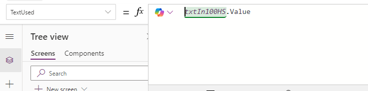
For the warning text, set the Text to count the rows left and display it to the user
Concatenate(Text(100-Len(txtIn100HS.Value))," Characters left")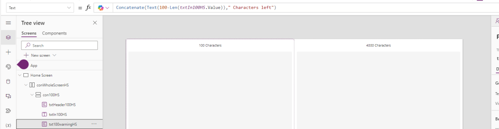
Next the color of the text will be set to one of three colors depending on the amount of text in the field. If it is greater then 50 (for the 100) example, it will be a light grey. If it is then 50 but greater then 10, it will be a light red. If it is less the 10, it will be bright red
If(
    100 - Len(txtIn100HS.Value) > 50,
    RGBA(
        139,
        154,
        159,
        1
    ),
    If(
        100 - Len(txtIn100HS.Value) > 10,
        RGBA(
            255,
            184,
            174,
            1
        ),
        RGBA(
            189,
            49,
            51,
            1
        )
    )
)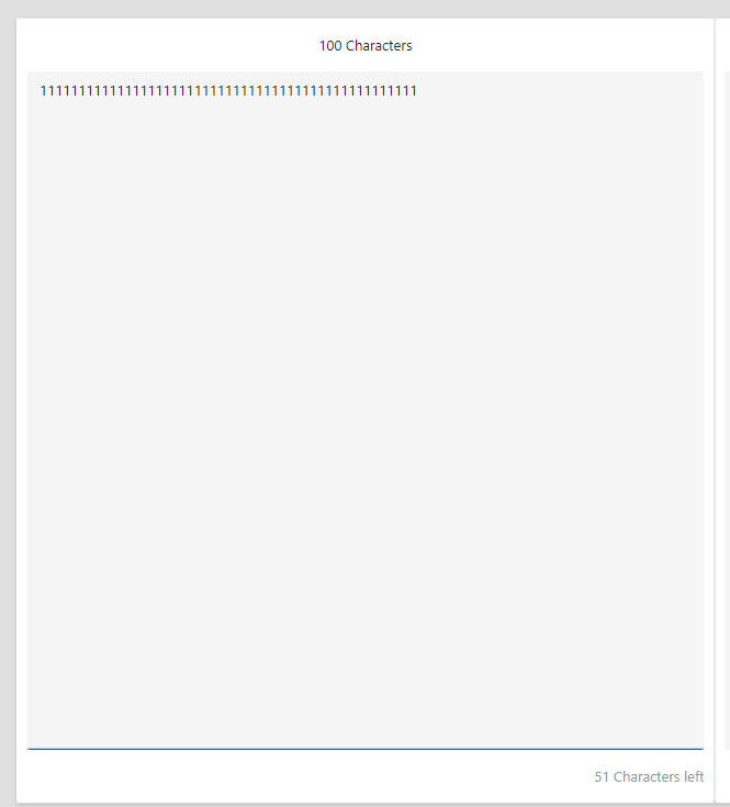
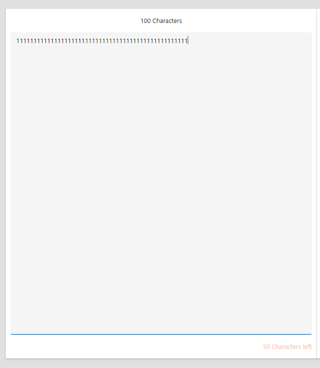
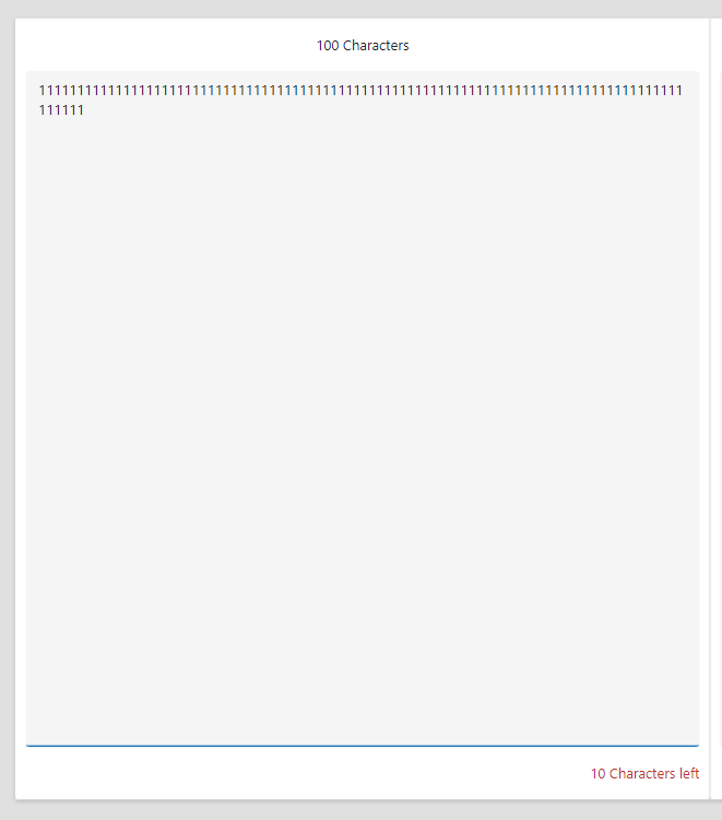
Finally, the visible of the warning will be if there are less then 50 characters, it will show the label or else it will be hidden. This will be a great way to only show the warning when the limit is getting close.
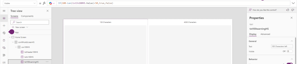
If(100-Len(txtIn100HS.Value)<50,true,false)Building it smarter
While we could do some copy pasta for each of the controls, that takes time and adds in the risk of creating errors. To mitigate this, we can leverage a few commands to get the max length from Dataverse itself. Set the numbers for the text to change color along with being visible to percentages and make the whole thing as a component.
Dataverse Lengths
Within the OnStart, I have declared 2 variables; varDemo 100 and varDemo4000. Each one will use the DataSourceInfo command to get the max length of each column
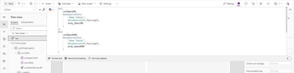
Set(
    varDemo100,
    DataSourceInfo(
        'Demo Tables',
        DataSourceInfo.MaxLength,
        andy_demo100
    )
);
Set(
    varDemo4000,
    DataSourceInfo(
        'Demo Tables',
        DataSourceInfo.MaxLength,
        andy_demo4000
    )
)
Canvas Component
The component will consist of a text box set to the width and height of the component itself.
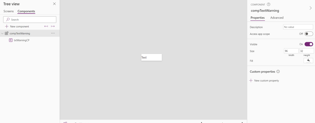
One integer input properties will be used to show the text on the screen. Max Length, a Text property called text used, along with one integer output property that will be used to control the visibility
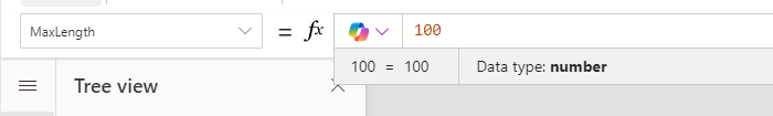
Max Length
Set the Max Length to blank.
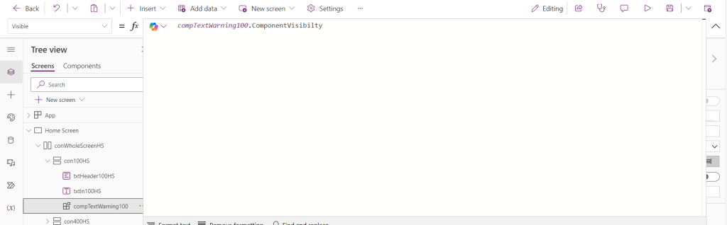
Visibility
The visibility will be set to show when half of the characters are remaining
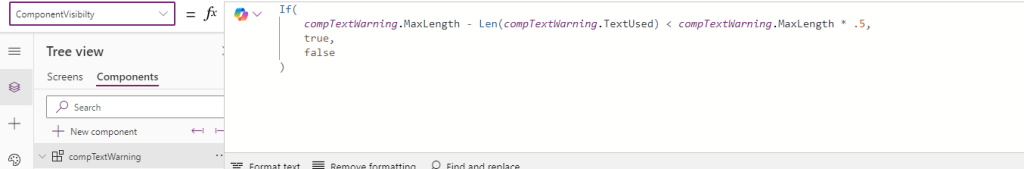
If(
compTextWarning.MaxLength - Len(compTextWarning.TextUsed) < compTextWarning.MaxLength * .5,
true,
false
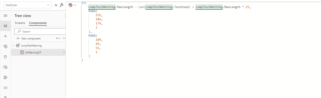
)Font Color
The font color will be far more simplified with just one If Statement
If(
    compTextWarning.MaxLength - Len(compTextWarning.TextUsed) > compTextWarning.MaxLength *.25,
    RGBA(
        255,
        184,
        174,
        1
    ),
    RGBA(
        189,
        49,
        51,
        1
    )
)
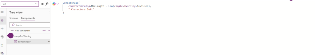
Text Box
The Text of the text box will be the same code as used before just swapped out with the input properties
Concatenate(
    compTextWarning.MaxLength - Len(compTextWarning.TextUsed),
    " Characters left"
)
Adding in the component
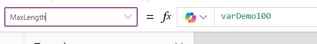
With the component built, I have added it to the app, deleted the old warning, and started adding in the values
Max Length
The Max length of each text input and the component can be set to its corresponding variable
Text Used
Visible
That was a fun build. If you have any questions, feel free to reach out!